
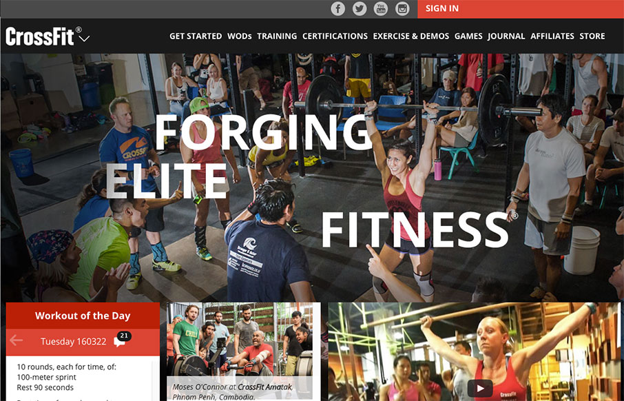
The CrossFit.com website has come a looooong way recently. This design isn’t perfect and I know there has been some hubub on it’s message boards about some UX issues. But really, it’s been optimized for mobile and tablets over desktop users. That’s really the crux of the problem IMHO. Otherwise, it’s a really beautiful upgrade to what we’ve had before.


Fitts’s Law: Why the Easy Button Wins
Large, close targets are faster to hit than small, distant ones, that’s Fitts’s Law. A look at the 1954 rule behind buttons, prime and magic pixels, thumb zones, and dark patterns.


0 Comments