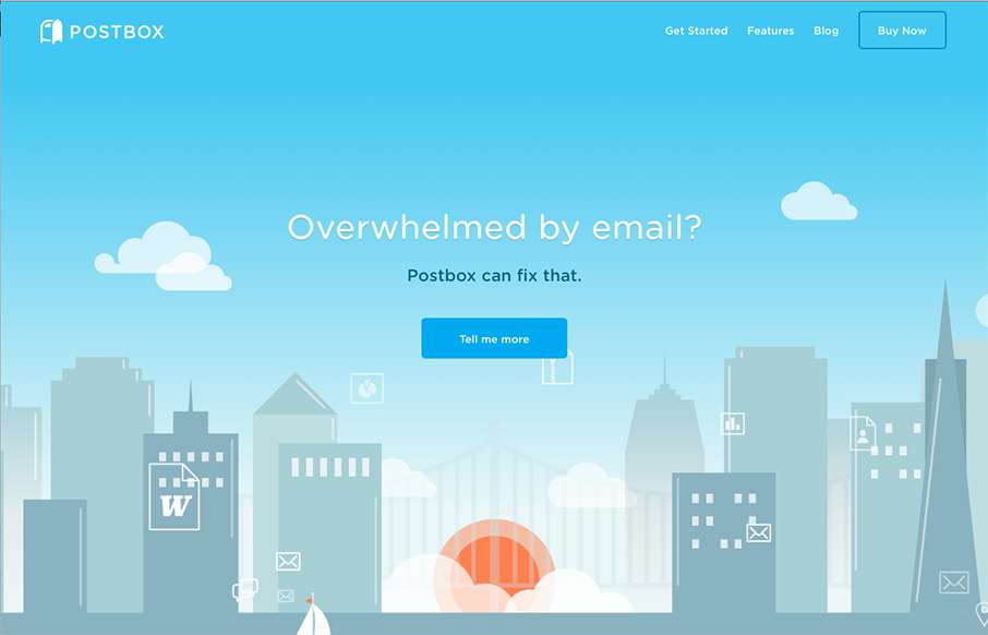
The Postbox website is in many ways a very typical product website design. But in other ways it’s far superior. It uses the normal patterns of showing off a product in a clean and simple way but has some really great deeply detailed sections that show how the app works. This is super important for an app like this, you have to get people to understand what it does and get them envisioning themselves using it quickly for conversions.
Glassmorphism: The Transparent Design Trend That Refuses to Fade
Glassmorphism brings transparency, depth, and light back into modern UI. Learn how this “frosted glass” design trend enhances hierarchy, focus, and atmosphere, plus how to implement it in CSS responsibly.


0 Comments