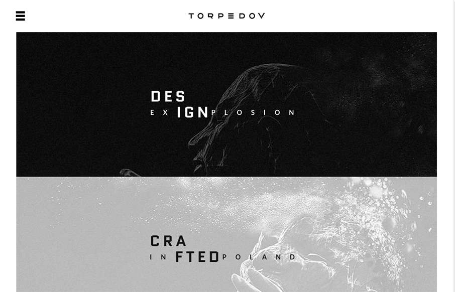
Pretty solid graphics on the home page, I dig that left or right choice. I also like how he’s used the hamburger menu thing in the logo look as well. It helps tie it together for people. Nice use of slight animations in the case study imagery as well.
From the Designer: Design Explosion – Crafted in Poland.
Submitted by: Piotr Swierkowski
Role: Designer
Country: Poland


0 Comments