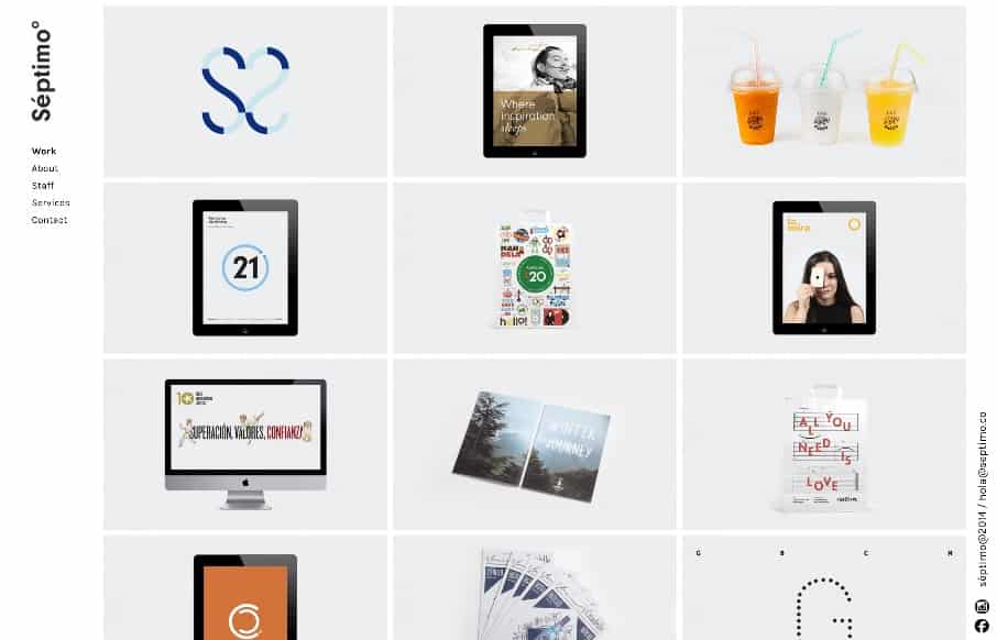
The strict “blocky” grid in this design is pretty cool. It’s been done before and fairly straightforward but when used in this context it feels fresh and unique almost. I dig the fixed left nav too. Check the different screen width design changes out as well.
Glassmorphism: The Transparent Design Trend That Refuses to Fade
Glassmorphism brings transparency, depth, and light back into modern UI. Learn how this “frosted glass” design trend enhances hierarchy, focus, and atmosphere, plus how to implement it in CSS responsibly.


0 Comments