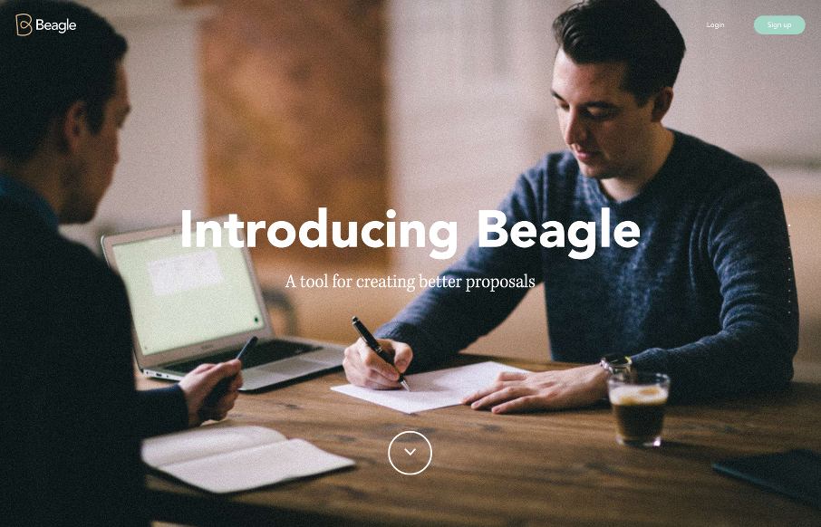
This Beagle app site (A tool for creating better proposals) looks to be designed by Podio in conjunction with Spring / Summer out of Copenhagen, Denmark. Listen, scroll-jacking as a designer may not be your thing, but when you see how tight this site is – you may rethink that. I agree that sites like this may have accessibility / fallback issues, but Unmatchedstyle focuses on design inspiration – so this is an inspiring site design-wise. Now.. if you can make the app (any apps) feel like the promo page, then we’re really getting somewhere – that’s for another post. Either way – take a look at this site and see how you can improve yours.


looks good mah dude. the transitions are ridiculously good