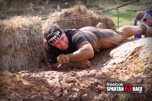
Today is Reebok Day. It could be that Gene and I are fanboys of Reebok, and in fact just ran our third Reebok sponsored Spartan Race this past Sunday in Atlanta (awesome images below). Plus, there’s some good design on the site and in the companies associated with Reebok too. The next three reviews all have that in common.
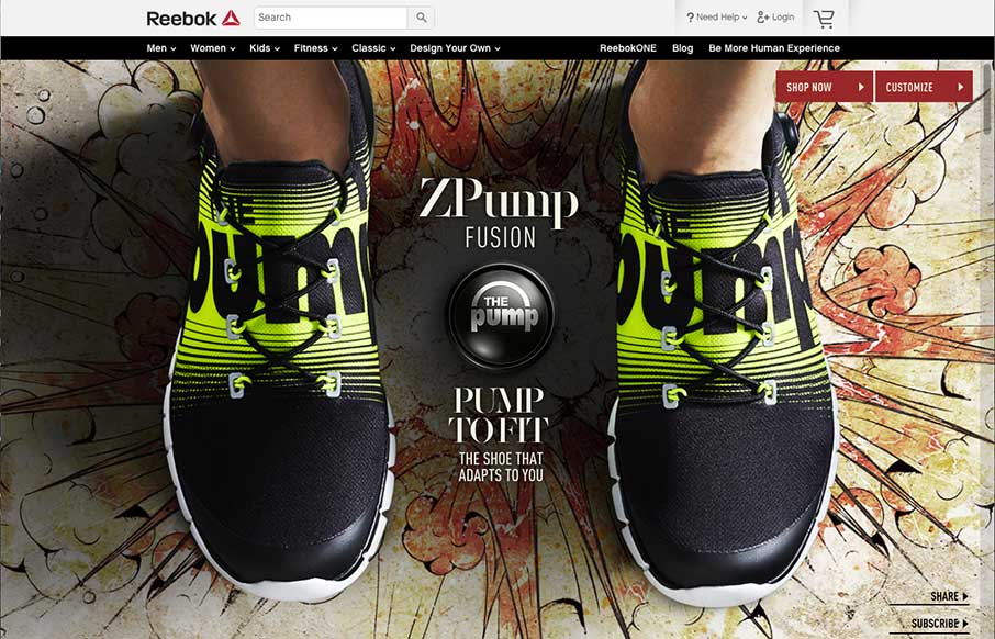
So when we saw that Reebok was releasing the ZPump Fusion – we took a look at the site – RAD. Voltage helped design it with Reebok’s internal team.
I really find this style of site interesting and cool. We saw a lot of them a couple of years ago – but they were all wonky and never moved as smoothly as you wanted. This type of scroll-jacking is an art form, further enhanced by a dynamic looking background that you kind of skate through down (and left and right) on the page.
Really like how they were able to simulate the effect from the video of the shoes morphing onto the feet. And the animated Pump button is a cool little effect too.
Just paid off the credit card… guess I’m about to use it again…
Atlanta Sprint – March 2015

Carolinas Beast – October 2014

Charlotte Sprint – March 2014


Thank you for the kind words about VOLTAGE. You have a great site. Keep up the great work!
Thanks Seth – enjoyed it!