Spindletop Design

http://spindletopdesign.com/

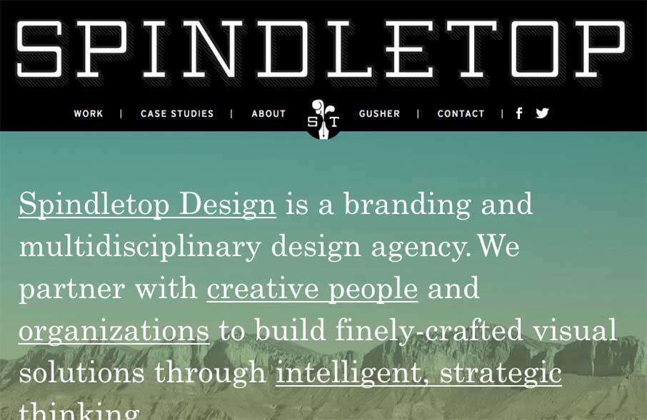
Really like the vibe coming from the Spindletop Design site, an agency out of Houston, Texas. It looks like they like to use a lot of text treatments in their site, and in their client work – which is cool, considering the graphic design trend of Lettering (or how to combine some awesome fonts, sizes, and styles into one image) is really starting to hit the web too. You can see this also in the header – they have a logo that points back to the top of the page, but the SPINDELTOP lettering is what points back to the home page.

Also like the faceted search they use for their Work page. Using the marks or logos for each project, instead of a screen shot classes up the joint.

Submitted by: Jennifer Blanco
Role: Designer & Developer
Twitter: @spindletopLLC

0 Comments

Submit a Comment

Your email address will not be published. Required fields are marked *

News & Articles

Sign-Up: Enhancing Conversions through good UX

Sign-Up: Enhancing Conversions through good UX

Optimize your website’s sign-up process by focusing on clarity, ease, and user mindset. Clearly explain the purpose, benefits, and steps, and use social proof to build trust and drive conversions.

The Essential Guide to Getting Started on Freelance Writing

The Essential Guide to Getting Started on Freelance Writing

Explore the lucrative and fulfilling world of freelance writing with our essential guide. Learn about specialties like blogging, social media, article, and technical writing. Build a portfolio, find work, set up your business, and discover the potential earnings. Embrace the freedom of working from home and follow tips for success in your dream career.