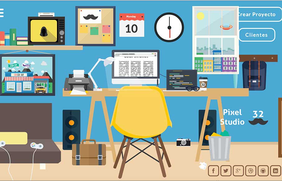
Pixel Studio 32

http://pixstudio32.com/

This review is taking a while to write… since I’ve been playing with their site for  half an hour… and then I showed it to my son, and my computer was commandeered for another fifteen minutes..

The entire site has a huge amount of time and effort put into it. The flat illustrations are more common in some sites now, but they way they display and allow you to play with them is unique (even the contact form). The only issue I saw was that the translation didn’t hold all the way through the site after selecting the English version – but Google Translate took care of it – and the site was fun enough to help me ignore it.


Submitted by: Juan Casabianca

Role: Designer & Developer

0 Comments

Submit a Comment

Your email address will not be published. Required fields are marked *

News & Articles

Sign-Up: Enhancing Conversions through good UX

Sign-Up: Enhancing Conversions through good UX

Optimize your website’s sign-up process by focusing on clarity, ease, and user mindset. Clearly explain the purpose, benefits, and steps, and use social proof to build trust and drive conversions.

The Essential Guide to Getting Started on Freelance Writing

The Essential Guide to Getting Started on Freelance Writing

Explore the lucrative and fulfilling world of freelance writing with our essential guide. Learn about specialties like blogging, social media, article, and technical writing. Build a portfolio, find work, set up your business, and discover the potential earnings. Embrace the freedom of working from home and follow tips for success in your dream career.