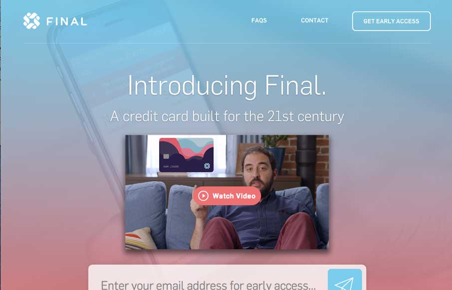
You just have to love a website design that get’s spacing. That’s the thing that hits me the most on this site, the spacing and timing of all the elements and sections as you scroll down. Put that together with the soft feel they’ve used for all the elements and this website feels like you want to hug it. Great work!
Glassmorphism: The Transparent Design Trend That Refuses to Fade
Glassmorphism brings transparency, depth, and light back into modern UI. Learn how this “frosted glass” design trend enhances hierarchy, focus, and atmosphere, plus how to implement it in CSS responsibly.


So, thos is this guy in the video? He has been in many startup and new product videos? anyone know?
Hey Brig – I wondered the same thing. Looked in their FAQ – not conclusive but:
Are you guys Coin? Is the CEO the beard guy?
We are not Coin. We worked with the same amazing production studio to make our video, but the main difference is that Coin puts multiple cards onto one piece of hardware, whereas Final is an entirely new credit brand.