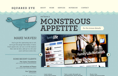
This is a really fun website, the whale illustration makes it really memorable. I especially like the carousel design for the portfolio section on the home page, the pop-up view of the next image is really clever. I’ll have to say that I do wish there was a ‘close’ to the page, like a footer or something. I’ve recently commented on something similar.
Glassmorphism: The Transparent Design Trend That Refuses to Fade
Glassmorphism brings transparency, depth, and light back into modern UI. Learn how this “frosted glass” design trend enhances hierarchy, focus, and atmosphere, plus how to implement it in CSS responsibly.


Incredible.. great color palette, organization, typography, hover states. Simply a great user experience.
I like how they did some slick stuff with the sub-navigation, portfolio and process, but it’s all very usable and well-done.
I love the whale theme and how they’ve cleanly blended an artistic angle with readability and ease-of-use.
Way to tie in the text from design to the whale theme.
Love the navigation panes across the front – makes for ease of use and brings beauty to the eye (…the freakin’ squared eye).