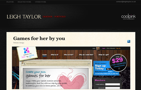
Nice looking single-page portfolio website layout. Nice use of a dark background and the hints of red and background texture is nice. The site doesn’t really use the light-box effect to the best of it’s ability, it seemed slow to load and the screen shots were larger than my screen when opened so I had to scroll to see the sample design. Maybe just linking to a sub page is what would be best in a case like this. Thoughts?
Glassmorphism: The Transparent Design Trend That Refuses to Fade
Glassmorphism brings transparency, depth, and light back into modern UI. Learn how this “frosted glass” design trend enhances hierarchy, focus, and atmosphere, plus how to implement it in CSS responsibly.


0 Comments