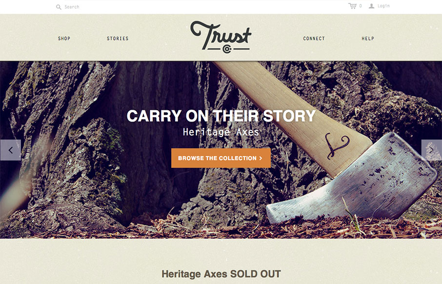
What a great website. First off it’s about Axes, which are just cool to think about and use. The design of the site has lots of little surprises but executed in a simple way. The main nav has these great large icons that are worked into the drop-down navigation lists. For me that’s a cool little moment when you mouse over them and see those illustrations. Then the area below the slideshow and main marquee items is designed in a way that feels like a collage of items. This breaks up what could be a pretty static design and keeps you interested visually all the way down the page. Wonderful and simple design.


Glassmorphism: The Transparent Design Trend That Refuses to Fade
Glassmorphism brings transparency, depth, and light back into modern UI. Learn how this “frosted glass” design trend enhances hierarchy, focus, and atmosphere, plus how to implement it in CSS responsibly.


0 Comments