Jamie Oliver’s Fifteen

Jamie Oliver’s Fifteen

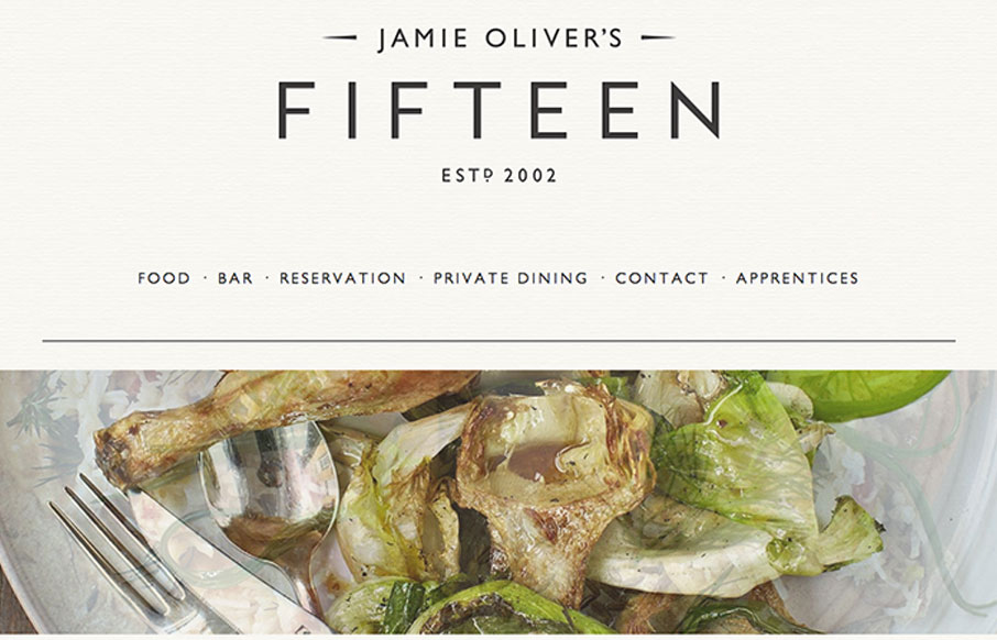
Just another polished, parallax site with beautiful imagery and svelte typography. Ho hum.

🙂 Doesn’t mean we can’t call it out for being nice, right? Either way, it’s got a nice feel and I appreciate subtle details like the rotating images and the progressively loading border under each nav item. (Is that what you call that thing?) Hover over the nav or watch it load as you scroll down through each section. Thanks to @jeffportaro for submitting the site!


Just another polished, parallax site with beautiful imagery and svelte typography. Ho hum.

🙂 Doesn’t mean we can’t call it out for being nice, right? Either way, it’s got a nice feel and I appreciate subtle details like the rotating images and the progressively loading border under each nav item. (Is that what you call that thing?) Hover over the nav or watch it load as you scroll down through each section. Thanks to @jeffportaro for submitting the site!

Kinsta

0 Comments

Submit a Comment

Your email address will not be published. Required fields are marked *

Time limit exceeded. Please complete the captcha once again.

News & Articles

The Call to Action, Revisited

The Call to Action, Revisited

The Call to Action hasn’t changed in a decade, but the bar has. A fresh look at prominence, copy, mobile tap targets, and accessibility, with lessons from three major design systems.

Brutalism: The Beauty of Breaking the Rules

Brutalism: The Beauty of Breaking the Rules

Brutalism in web design rejects perfection for authenticity. Stark grids, raw type, and honest structure create interfaces that feel human, intentional, and impossible to ignore. Break the rules, on purpose.
