
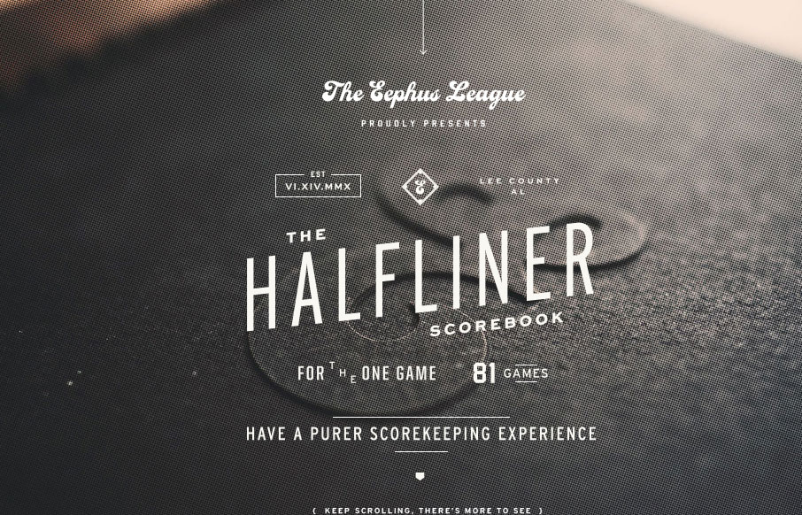
The Eephus League website is damn pretty. When you get down to it, the site is fairly simple and straight-forward: big, lovely imagery, interesting throwback typography, and just enough small details to keep things interesting; but simple and straight-forward does not mean that a site isn’t beautiful. I really enjoy the mix of details, which have a magazine-like quality. Dig it.


Fitts’s Law: Why the Easy Button Wins
Large, close targets are faster to hit than small, distant ones, that’s Fitts’s Law. A look at the 1954 rule behind buttons, prime and magic pixels, thumb zones, and dark patterns.


0 Comments