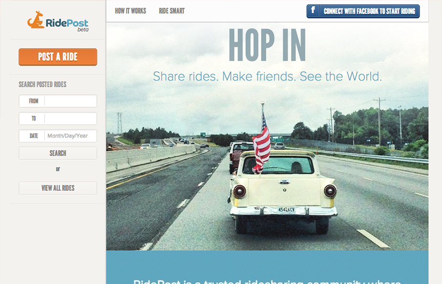
I like the fixed window feel to this design. With the header and sidebar staying put the section that scrolls gives the site a real app-like feel. I do wish it was responsive, it would make a lot of sense too for the site/app I think. My favorite part is the icon/illustration section where the page informs you on what RidePost is. It’s clear and concise and works non-linearly which is great because the idea of the app is a bit complicated.
Glassmorphism: The Transparent Design Trend That Refuses to Fade
Glassmorphism brings transparency, depth, and light back into modern UI. Learn how this “frosted glass” design trend enhances hierarchy, focus, and atmosphere, plus how to implement it in CSS responsibly.


Re: responsiveness => I’m working on it 🙂
Need more designers/developers… I’m by myself!