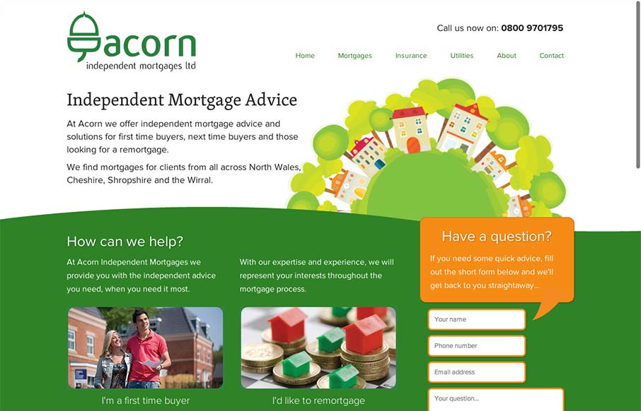
There’s a lot to like about this design. The animation of the rows of houses spinning in a big circle like that is used perfectly in conjunction with the rest of the otherwise static feeling design. The design doesn’t beat you over the head with the animation either. I like the way the header springs down as you scroll and stays fixed as well as I like the drop down nav design. The remainder of the sub pages get pretty stale since they’re all so similar but that’s how most websites work, right? Overall pretty good corporate yet friendly feeling design here.


Glassmorphism: The Transparent Design Trend That Refuses to Fade
Glassmorphism brings transparency, depth, and light back into modern UI. Learn how this “frosted glass” design trend enhances hierarchy, focus, and atmosphere, plus how to implement it in CSS responsibly.


0 Comments