Submitted by: Raynner Patry @raynner
Role: Developer
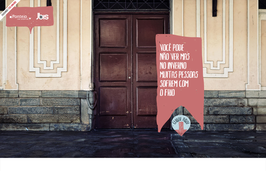
This site uses simple transitions and animations to wonderful effect and creates a narrative that is both poignant and surprising. It also has a nice mix of realism and handicraft. Nice.

Submitted by: Raynner Patry @raynner
Role: Developer
This site uses simple transitions and animations to wonderful effect and creates a narrative that is both poignant and surprising. It also has a nice mix of realism and handicraft. Nice.
Submitted by: Raynner Patry @raynner
Role: Developer
This site uses simple transitions and animations to wonderful effect and creates a narrative that is both poignant and surprising. It also has a nice mix of realism and handicraft. Nice.
Glassmorphism brings transparency, depth, and light back into modern UI. Learn how this “frosted glass” design trend enhances hierarchy, focus, and atmosphere, plus how to implement it in CSS responsibly.
Brutalism in web design rejects perfection for authenticity. Stark grids, raw type, and honest structure create interfaces that feel human, intentional, and impossible to ignore. Break the rules, on purpose.
Monochrome Minimalism merges Bauhaus discipline with IKEA simplicity. Clean grids, muted tones, and functional beauty create digital calm, proof that restraint, not decoration, defines timeless design.
Very strange choice… An I was surprised you though it was worth showing in the gallery :/ It seems like you selected it mostly because it had something to do with the donations… Other than that it’s not even responsive, the only thing that is interesting is the kid, very strange indeed
I think it’s mostly like Giovanni said Jack. It’s the visual narrative that looks compelling to me too.
I see what you mean. I agree that maybe in it’s simplicity and narrative it has a touch of genius. Thanks, it’s always good to know why people think about some stuff that you might see different 🙂
Couldn’t agree more. It would be cool if the site was responsive though!