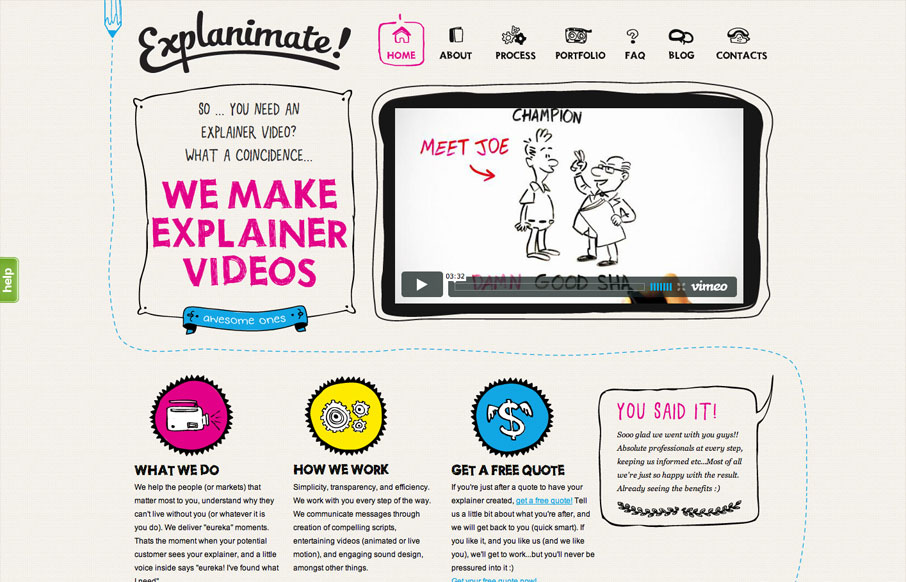
The website is built visually around what these guys do as a service. They illustrate what your product or service does, so they use that same skill on their own stuff. Very fun and open feel. Simple colors and type all work in tandem together like it should. I’m not sure about the chat box that pops up after a while, it feels a bit intrusive for the type of website and service this is. The site looks great though, which is why I noticed it.


Glassmorphism: The Transparent Design Trend That Refuses to Fade
Glassmorphism brings transparency, depth, and light back into modern UI. Learn how this “frosted glass” design trend enhances hierarchy, focus, and atmosphere, plus how to implement it in CSS responsibly.


Thanks Gene! Glad you like it. And thanks for featuring us…