
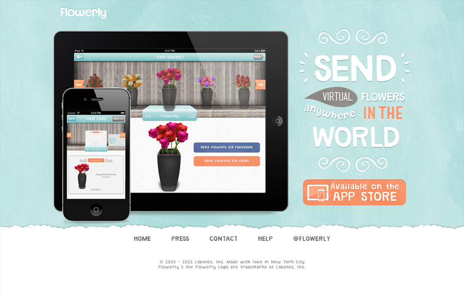
Great looking single page iPad/iPhone app site. Custom lettering FTW too! I love it, that block of text on the right side is immaculate. Down to the custom lettered “app store” button. I’m not entirely sure why there’s a “home” button on a single page app, but maybe there’s plans for subpages down the road. Overall though, lovely design here that does it’s job well.


Chunking: How to Design for a Brain That Can Only Hold Four Things
Your working memory holds about four things, not seven. Chunking groups loose information into meaningful units that slip past that limit, the psychology behind phone numbers, scannable pages, multi-step forms, and grouped navigation.


As much as I like the design and overall look & feel, it leaves me questioning the gallery approval process you use to list sites on here.
This example isn’t responsive, ok not the be all and end all I suppose. The links in the nav (press, contact, help) point to email addresses (poor usability) and the Twitter page has a completely different look and feel to the website design.
It’s simple James. I liked it, so it got listed in the gallery!
I really really appreciate you taking the time to comment too man! I agree with you on the nav items opening email address that drives me crazy, but I think overall the things I pointed out in my post about the design explain why I like it. I love that type work a lot.