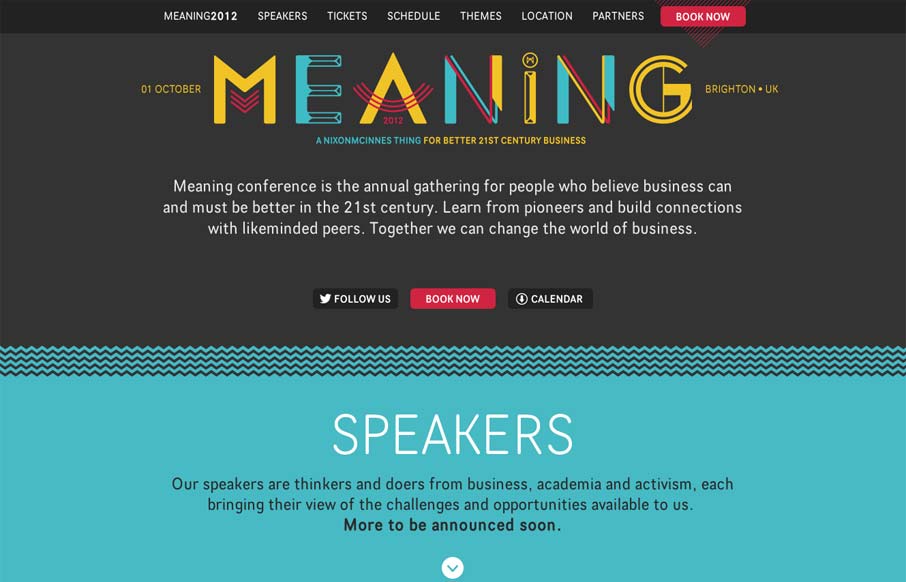
Nice clean conference website design. I like the mix of the green and dark grey. The “book now” button is very clearly/obvious by being red and they also designed that little triangle pattern behind it. The sections are clearly marked with wavy lines and different color blocks. It’s a great study in clean and clear design for a conference website.


The Call to Action, Revisited
The Call to Action hasn’t changed in a decade, but the bar has. A fresh look at prominence, copy, mobile tap targets, and accessibility, with lessons from three major design systems.


0 Comments