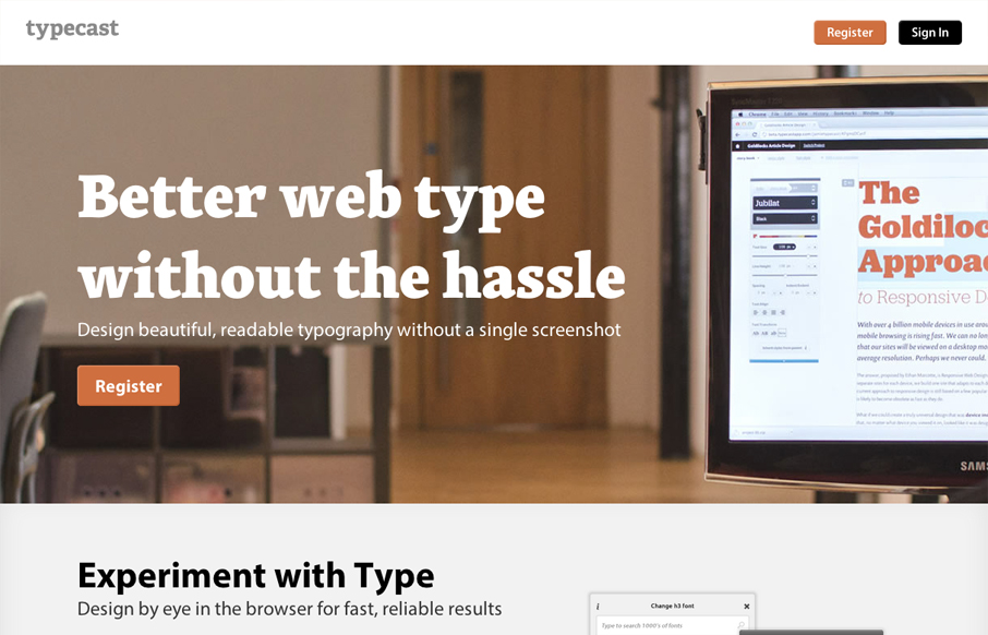
Aside from what looks like a brilliant app. The typecastapp.com website is very well produced. I like asymmetrical layout a lot, the right side is heavy with visuals and it really helps to draw you down the page more. Keeping your eyes focused on that right side somehow makes the copy heavy left side easier and faster to take in. Also, you’d expect a website/app all about type to be beautifully designed and this site doesn’t disappoint, from the type choices to the spacing and rhythm of all the discreet details. Wonderful work.


Glassmorphism: The Transparent Design Trend That Refuses to Fade
Glassmorphism brings transparency, depth, and light back into modern UI. Learn how this “frosted glass” design trend enhances hierarchy, focus, and atmosphere, plus how to implement it in CSS responsibly.


0 Comments