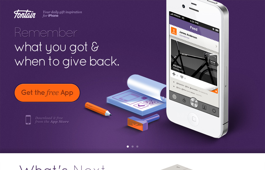
I love how all the items/things used on the page are rendered, even the iPhone. It creates a very unique vibe. I love the colors and the dark first half and light second half, it creates a nice dichotomy for the site design. I also dig the way the slideshow is used, it introduces and almost animated aspect instead of just showing more product shot. Very smart site.


Glassmorphism: The Transparent Design Trend That Refuses to Fade
Glassmorphism brings transparency, depth, and light back into modern UI. Learn how this “frosted glass” design trend enhances hierarchy, focus, and atmosphere, plus how to implement it in CSS responsibly.


0 Comments