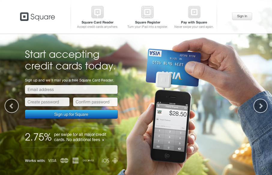
I love the super simple direction of the Square App home page. It’s deceptively simple in that there’s one thing they want you to do, signup. But it’s done with a slideshow that loads in different signup options with each type of product and it’s a slick way to deliver it. There’s so few elements here yet so much visual depth, superb design and superb call to action to boot.


Glassmorphism: The Transparent Design Trend That Refuses to Fade
Glassmorphism brings transparency, depth, and light back into modern UI. Learn how this “frosted glass” design trend enhances hierarchy, focus, and atmosphere, plus how to implement it in CSS responsibly.


This site is obviously inspired by Apple, especially if you compare the iPad features page (http://www.apple.com/ipad/features/) to The Square Reader page (https://squareup.com/square). I think this is smart since Square relies on a device like the iPad, and the visual connection allows them to co-opt some of Apple’s mojo.