
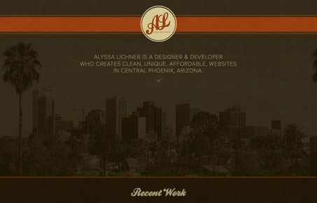
Alyssalichner.com has a beautiful handle on earthy, rich color. The site is just a portfolio and contact point for Alyssa and does a goo job of showcasing a simple approach to web design rooted in texture and typography. I’m particularly ford of the form fields. Their orange borders and text create a pleasant rhythm, though it can be a little hard to read.


Chunking: How to Design for a Brain That Can Only Hold Four Things
Your working memory holds about four things, not seven. Chunking groups loose information into meaningful units that slip past that limit, the psychology behind phone numbers, scannable pages, multi-step forms, and grouped navigation.


0 Comments