
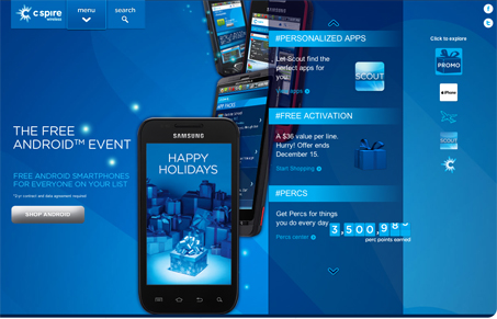
My first impression was that this is a different and almost strange layout. I thought “Where am I going to look first?” But very quickly I found myself engaging with the site in a way that somehow felt natural. The compartmentalization (dang that’s a long word) works and kind of mimics a mobile app environment which is neat. The color scheme is mostly monochrome but has a nice layered depth. The vertical parallax adds a nice touch too. The product results page seems disjointed from the rest of the site but overall there are some nice details considered here.


Fitts’s Law: Why the Easy Button Wins
Large, close targets are faster to hit than small, distant ones, that’s Fitts’s Law. A look at the 1954 rule behind buttons, prime and magic pixels, thumb zones, and dark patterns.


0 Comments