
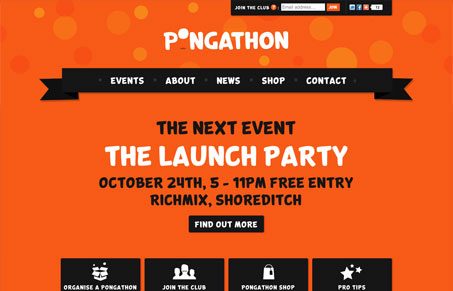
I like how this home page rides right on the edge of being an info-graphic. It plays with the context in a highly visual way and delivers standard website navigation stuff just the same without being confusing. I really love the “what type are you” icons at the bottom of the page the most. Very fun, plus orange and black are an awesome color duo.




0 Comments