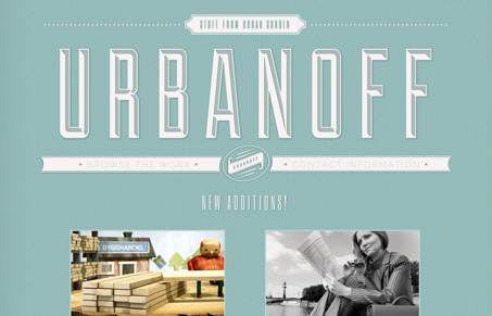
There’s a lot to like on this site. The big chiseled type logo is really well done. I also love the ‘back/next’ navigation links on the work pages. The monochrome color scheme works well too, and helps the large portfolio screenshots stand out. It would be nice if there was an different design for the subpages. The huge logo is a good first impression, but once we’ve seen it, it would be better to focus on other content on other pages. Overall, this is a very nice site that should have a little more time spent on it to be fully complete.
Glassmorphism: The Transparent Design Trend That Refuses to Fade
Glassmorphism brings transparency, depth, and light back into modern UI. Learn how this “frosted glass” design trend enhances hierarchy, focus, and atmosphere, plus how to implement it in CSS responsibly.


0 Comments