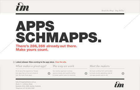
Imagemechanics.com.au is a single page scroller that pages like a more traditional site. The transitions between content ‘pages’ are very smooth and sophisticated, especially transitioning away from the homepage. The navigation doesn’t really feel like a traditional nav bar with on or two word links to get to other content areas, but everything is pretty clearly labeled with arrows. I think that imagemechanics strikes a nice balance between established design patterns and experimentation with interaction. Stylistically, there is little to imagemechanics that we haven’t seen before: large type, minimalist interface, strong grid-based design, etc. However, the content is laid out quite well, is easy to consume and effectively communicates their approach to designing for interaction.
Glassmorphism: The Transparent Design Trend That Refuses to Fade
Glassmorphism brings transparency, depth, and light back into modern UI. Learn how this “frosted glass” design trend enhances hierarchy, focus, and atmosphere, plus how to implement it in CSS responsibly.


0 Comments