2011.full-frontal.org

full-frontalorg

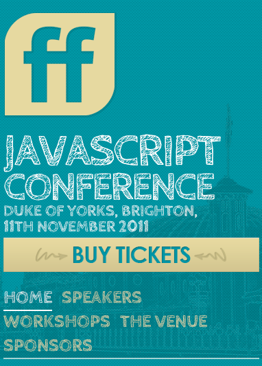
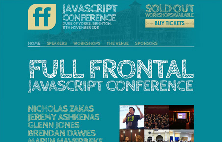
I like the colors of this conference website. The strong graphic look works well with the typeface too. I do feel like there may be too much of that hand written “colored” in type, a good pairing mixed into the thick of it would go a long way. The second typeface choice looks really great in the secondary sections of the site.

fullfrontal-rwd

I love that it’s responsive too, the strong graphic look works extra well in the handheld screen size most of all.

0 Comments

Submit a Comment

Your email address will not be published. Required fields are marked *

News & Articles

The Essential Guide to Getting Started on Freelance Writing

The Essential Guide to Getting Started on Freelance Writing

Explore the lucrative and fulfilling world of freelance writing with our essential guide. Learn about specialties like blogging, social media, article, and technical writing. Build a portfolio, find work, set up your business, and discover the potential earnings. Embrace the freedom of working from home and follow tips for success in your dream career.