gobloomhealth.com

gobloomhealthcom

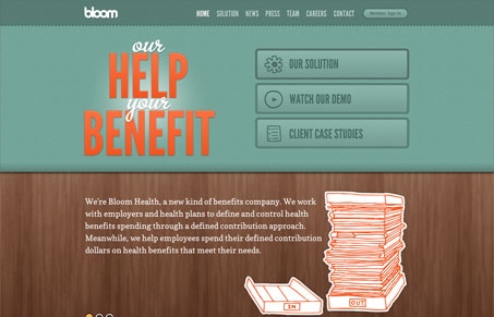
This is definitely not what I think of when I think about insurance benefits sites. It’s modern and refreshing – it’s even responsive! The doodle illustrations are friendly and have a fun contrast against the more realistic textures of the background.

The content is really well organized and laid out so that the regular person can easily understand how Bloom works. I enjoyed how they broke up the content on the subpages which kept it interesting and fun to digest.


gobloomhealthcom

This is definitely not what I think of when I think about insurance benefits sites. It’s modern and refreshing – it’s even responsive! The doodle illustrations are friendly and have a fun contrast against the more realistic textures of the background.

The content is really well organized and laid out so that the regular person can easily understand how Bloom works. I enjoyed how they broke up the content on the subpages which kept it interesting and fun to digest.

Kinsta

0 Comments

Submit a Comment

Your email address will not be published. Required fields are marked *

Time limit exceeded. Please complete the captcha once again.

News & Articles

The Call to Action, Revisited

The Call to Action, Revisited

The Call to Action hasn’t changed in a decade, but the bar has. A fresh look at prominence, copy, mobile tap targets, and accessibility, with lessons from three major design systems.
