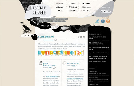
Pretty cool vibe with the illustrations, it really sets the tone for the music too I think. It’s not a complex execution of a website but it doesn’t always have to be that way does it? I like the way the general blog like content area is broken up into that 2 column layout, it’s much easier to take in all that info. The footer is fun too – is that a guy punching some kind of large porcupine?


0 Comments