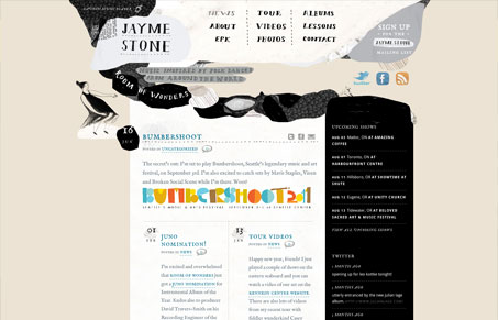
Pretty cool vibe with the illustrations, it really sets the tone for the music too I think. It’s not a complex execution of a website but it doesn’t always have to be that way does it? I like the way the general blog like content area is broken up into that 2 column layout, it’s much easier to take in all that info. The footer is fun too – is that a guy punching some kind of large porcupine?
Glassmorphism: The Transparent Design Trend That Refuses to Fade
Glassmorphism brings transparency, depth, and light back into modern UI. Learn how this “frosted glass” design trend enhances hierarchy, focus, and atmosphere, plus how to implement it in CSS responsibly.


0 Comments