
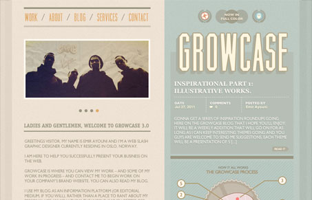
Growcase.com has great color and strongly integrated graphics and typography. I’d like to see a little more contrast just for readability (let me just note that I’m only looking at this site on a pretty standard monitor from BestBuy and my Macbook Pro) but I think part of the readability issue is that everything is set in caps which destroys word shape and scannability. I especially like that the site is divided into two halves and the backgrounds extend to the edge of the browser with both colors. It has the effect of integrating the browser into the actual design of the site as opposed to simply framing it.




0 Comments