atlason.com

atlasoncom

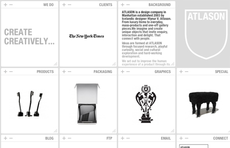
Beautiful design on the surface, I always enjoy experimental layouts & UX like this. The + & – symbols to open and close the blocks is fun. I think you can classify this site as a responsive width design – at least it responds visually to browser screen widths. However in all practicality it’s likely fairly unusable to your average user. Not sure if that matters to these guys or not – It is a fun site to click around on.

Kinsta

0 Comments

Submit a Comment

Your email address will not be published. Required fields are marked *

Time limit exceeded. Please complete the captcha once again.

News & Articles

Brutalism: The Beauty of Breaking the Rules

Brutalism: The Beauty of Breaking the Rules

Brutalism in web design rejects perfection for authenticity. Stark grids, raw type, and honest structure create interfaces that feel human, intentional, and impossible to ignore. Break the rules, on purpose.

Monochrome Minimalism

Monochrome Minimalism

Monochrome Minimalism merges Bauhaus discipline with IKEA simplicity. Clean grids, muted tones, and functional beauty create digital calm, proof that restraint, not decoration, defines timeless design.

4 CSS Features That Changed Everything

4 CSS Features That Changed Everything

Over the past five years, a handful of new CSS features have completely reshaped how we build for the web. According to the 2025 State of CSS Survey, these are the true game-changers.