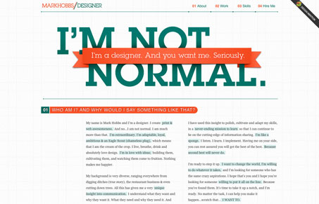
I really like seeing how designers utilize the single page scrolling format, largely the resume format for their website design. Markhobbs.net is a nicely done & nicely executed version of that theme. I like the overall look & feel, with the grid lines in the background & the use of tight little details here and there. The info-graphics are also a very nice touch, effectively communicating what he wants you to know about him and showing how he has the skills to communicate at the same time.


0 Comments