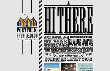
This design reminds me of those turn of the century posters where they used as many display fonts as possible. I love it, it’s also a pretty darn cool example of executing that design style with web fonts. It doesn’t all look like live fonts but the idea is there for sure. I really love how the images in the fixed sidebar change as you scroll too. Great stuff!
Glassmorphism: The Transparent Design Trend That Refuses to Fade
Glassmorphism brings transparency, depth, and light back into modern UI. Learn how this “frosted glass” design trend enhances hierarchy, focus, and atmosphere, plus how to implement it in CSS responsibly.


0 Comments