
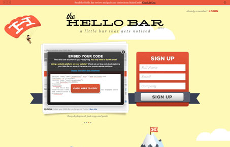
From a content & communication standpoint there isn’t a ton of depth here, there’s really only a couple of screenshots to show off the app. But it’s a nicely designed single page with really vibrant colors and nice illustrations. This might be all it needs to stick in your memory. Love the animated clouds too.




0 Comments