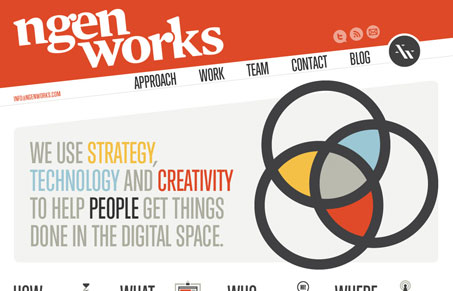
The new site for nGen Works is a top-notch example of both design and craft. It’s an exercise in subtlety and bold graphics at the same time. The colors speak loudly but there’s depth in the details and craftsmanship in the site that I love to see. The horizontal navigation gives it just that needed since of differentiation and the clean/bold illustrations give it a sense of finish.
Each page is different enough to keep you engaged and clicking through the website, you’re rewarded too as you do just that. Heck, they got the Happy Webbies illustrator to do a version of each team member – that’s cool. And check out the portfolio detail pages too.
Very very nice website here. I love it!


Thank you so much for the kind words. If you’d like some insight into the process we went through checkout Jeff’s video: http://www.ngenworks.com/blog/on-the-ngen-works-website-redesign/#comments
Thanks again!
That’s a very insightful video Carl, I went ahead and linked it up in the podcast too.