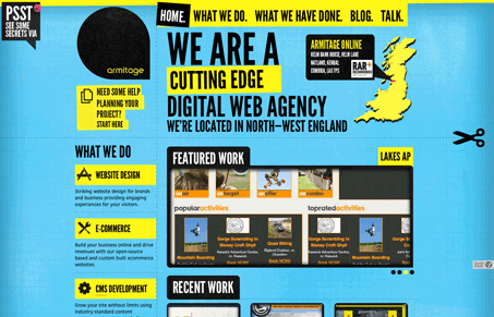
Both Julia and I think the site is interesting, check out the screen cast for the full review, it’s almost too much visually but generally it comes off looking fun. The almost oversized type and loud coloring sets the tone for this agency I think. There is still a good deal of detail across this website design that for me at least gives it that sense of well crafted design that it needs to finish it off. Overall this is a good design I think, it could have easily gone the other way but the designer’s attention to detail keeps the design sailing high for me.


Thanks for doing a review on our site, glad you liked the headers.