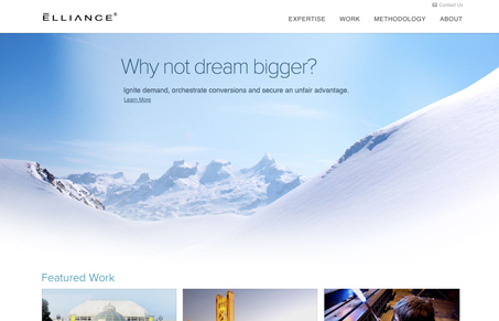
Pretty neat design, the large image used in the background also serves to set the tone of coolness and openness for the design/brand. I like that each sub page has been edited visually and new elements are brought in on each, but in some of the page it feels a bit disjointed to me. Perhaps it’s because i’m taken from really text heavy to image heavy and back and fourth. Overall though this is a really nice corporate design.


0 Comments