
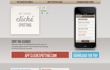
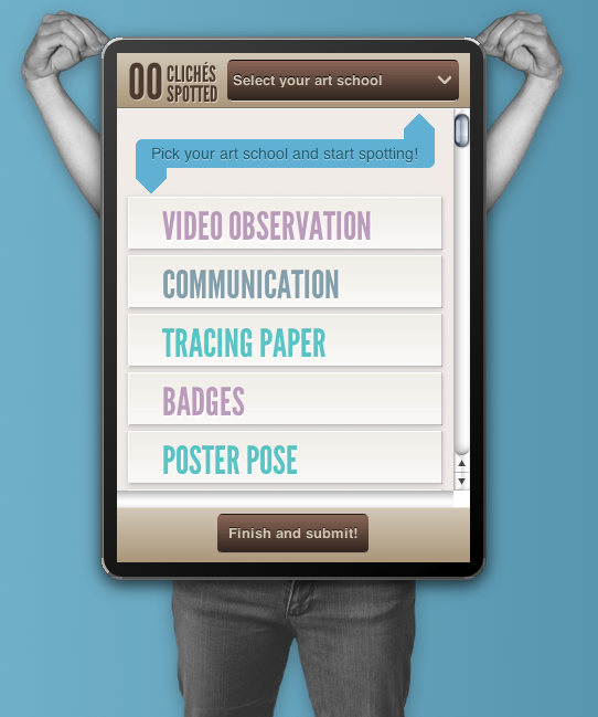
Clever website and iPhone site/app concept. The iPhone site/app is by far superior to the main website in many ways. I do like the feel of it, it has a nice soft feel and the colors all mesh well together. It does indeed have some design cliches to show off and it’s all in good fun, I love that the most.




0 Comments