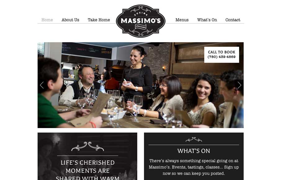
by Gene Crawford | Jul 29, 2014 | Food and Beverage, Gallery
We love websites that make great use of fonts, and Massimo’s Cucina Italiana uses a couple of different fonts, accent illustrations, vibrant pictures, and black, white, and gray to tell the story of their restaurant. Simple, and effective. Submitted by: Landon...
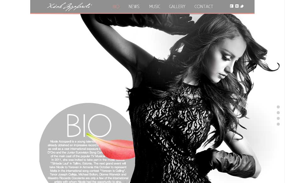
by Aaron Griswold | Jul 29, 2014 | Entertainment, Gallery
Great use of parallax with flying flower petals, bios, and a singer. Also like the use of texture in one of the sections, and then subtler parallax in another section to give some differentiation. Submitted by: Justin Sammut Role: Designer
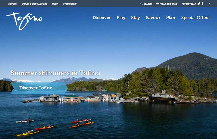
by Aaron Griswold | Jul 28, 2014 | Gallery, Travel
Cool use of different elements and shapes to give clear section delineations on the home / single page design. Also like the only drop-down in the top right corner (arrow) that works as a dashboard for the site. Submitted by: Jim Morris @ventureweb Role:...
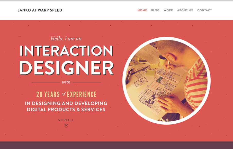
by Aaron Griswold | Jul 28, 2014 | Gallery
Hallo Janko! You probably know we see a lot of portfolio sites from graphic and web designers, but not as much from interaction / dashboard designers and developers (if that is a separate category). Janko’s site has a cool feel to it, and in the Works area, you...
by Aaron Griswold | Jul 28, 2014 | Gallery
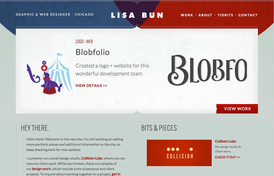
Cool to see portfolio sites from graphic designers. They always put a little more into the aesthetic design of the site like Lisa has. Fits with her motto of “Be Creative, Keep it Simple”. This is the website and portfolio of Lisa Bun, a graphic and web...