
by Gene Crawford | Oct 15, 2014 | Gallery
The page just keeps going and going, but it’s all good stuff. That’s rare for website’s I come across.
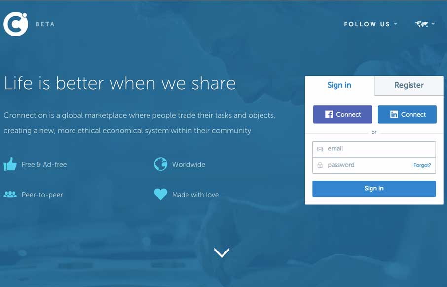
by Gene Crawford | Oct 15, 2014 | Gallery
I love a lot of the detail work in the different visual sections of this site. The way things are stacked and lined up is pretty tight and while very similar to other website’s feels a little different somehow. Submitted by: Álvaro Castaño @cronnection Role:...
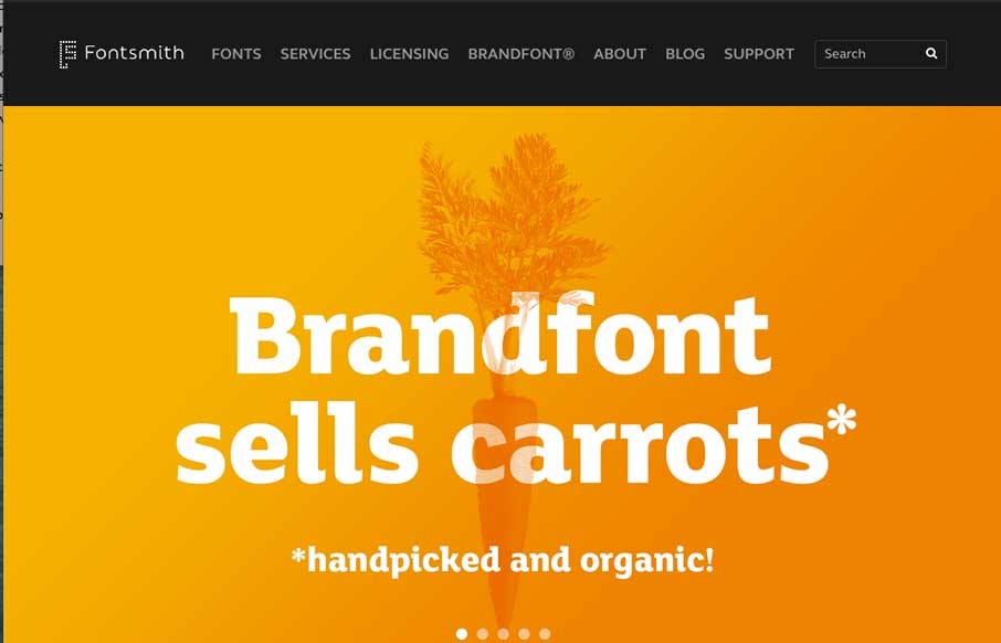
by Gene Crawford | Oct 15, 2014 | Gallery
Very clean and simple design but very effective. Especially for font websites brevity is clarity. Luuurrve this.
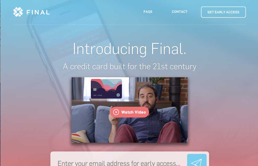
by Gene Crawford | Oct 14, 2014 | Gallery
You just have to love a website design that get’s spacing. That’s the thing that hits me the most on this site, the spacing and timing of all the elements and sections as you scroll down. Put that together with the soft feel they’ve used for all the...
by Gene Crawford | Oct 14, 2014 | News, Podcast, UMS Video Podcast
Wren Lanier @heywren Designing on the z-axis Mobile experiences can be wonderful, but screen real estate is always limited. The context of content can be difficult to understand when experienced in such small chunks. Wren Lanier has developed a number of ideas about...