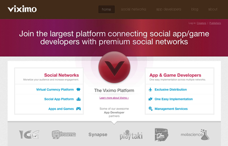
This design is cool how it uses the “V” placed in the center of the page and then have the rest of the elements aligned around it in such a symmetrical way like that. That’s clever and really makes you focus on those links, which makes the little icons even more important for visual impact. Overall the site is clean and corporate feeling and it honestly took me a couple of minutes to really figure out what it was selling, once into it the app/platform looks really cool. I just think that story could have been told faster and more completely than the current headline copy maybe.
Monochrome Minimalism
Monochrome Minimalism merges Bauhaus discipline with IKEA simplicity. Clean grids, muted tones, and functional beauty create digital calm, proof that restraint, not decoration, defines timeless design.


0 Comments