teamexcellence.com

teamexcellencecom

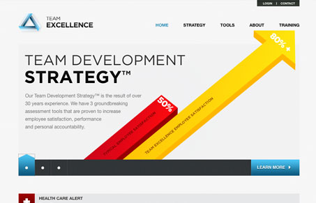
I like the big bold info-graphics used on the home page of the Team Excellence website. There’s a ton of information on this site, graphs and charts and psychological explanations and the design makes it all seem like it’s accessible to anyone. A good design can do that.

Kinsta

1 Comment

  1. Gavan Brown

    Nice use of bar graphs, poor logo implementation.. too light, requiring drop shadow.

    The rest is fairly standard fair… light grey, blue-teal, slideshow, serif fonts. Overall nice though.

    Reply

Submit a Comment

Your email address will not be published. Required fields are marked *

Time limit exceeded. Please complete the captcha once again.

News & Articles

Brutalism: The Beauty of Breaking the Rules

Brutalism: The Beauty of Breaking the Rules

Brutalism in web design rejects perfection for authenticity. Stark grids, raw type, and honest structure create interfaces that feel human, intentional, and impossible to ignore. Break the rules, on purpose.

Monochrome Minimalism

Monochrome Minimalism

Monochrome Minimalism merges Bauhaus discipline with IKEA simplicity. Clean grids, muted tones, and functional beauty create digital calm, proof that restraint, not decoration, defines timeless design.

4 CSS Features That Changed Everything

4 CSS Features That Changed Everything

Over the past five years, a handful of new CSS features have completely reshaped how we build for the web. According to the 2025 State of CSS Survey, these are the true game-changers.