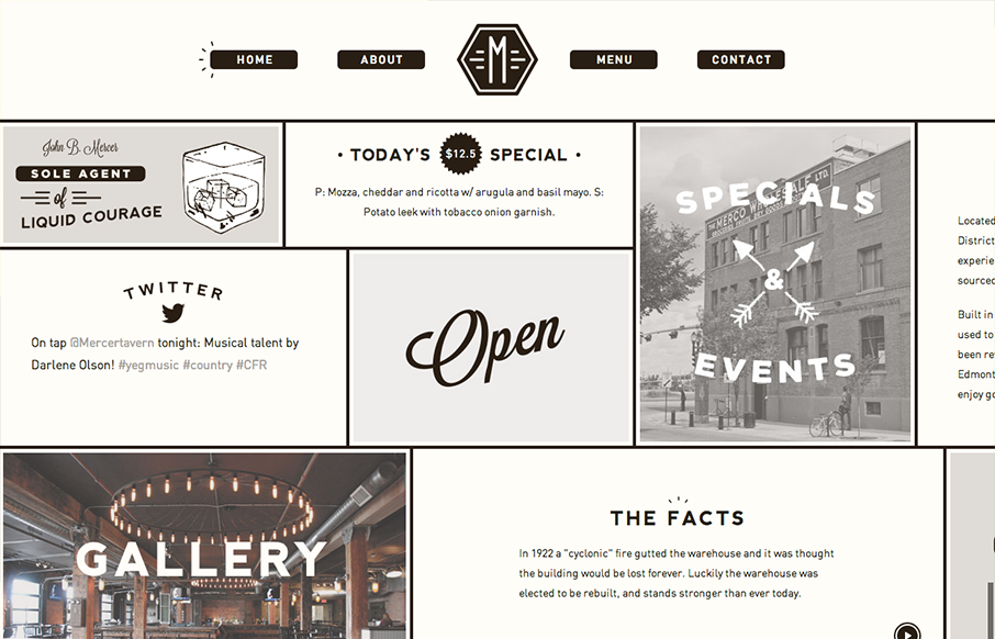
Interesting single page design. It scroll sideways which gives it an extra push of into making if “feel” really graphic. Not sure that makes sense, but it did in my head. I’m not normally a fan of tricks like this side scroll design here. But for some reason it just feels like it works to me. Maybe it’s the strong lines on the newspaper like feel and the stark graphic type mixture and black and white. Don’t know but I like it. What do you think?


Glassmorphism: The Transparent Design Trend That Refuses to Fade
Glassmorphism brings transparency, depth, and light back into modern UI. Learn how this “frosted glass” design trend enhances hierarchy, focus, and atmosphere, plus how to implement it in CSS responsibly.


0 Comments