
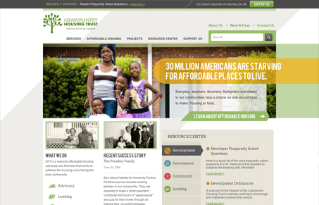
Super nice looking design for this Real Estate loan organization. The main horizontal design of the navigation is smartly sectioned between main content and “about” type content, I love the way that visual hierarchy is pulled off here. The colors are also very fresh feeling for a real estate website, which is good in this case because of the type of lending organization it is. The sub pages are all also well thought out and have plenty of great “localized” feeling photography – meaning they don’t feel like stock or really even staged shots, i’m left thinking these are real people who have used this company before. Very well done.




Thanks for the review guys! We were happy to have the opportunity to work with such a great organization.