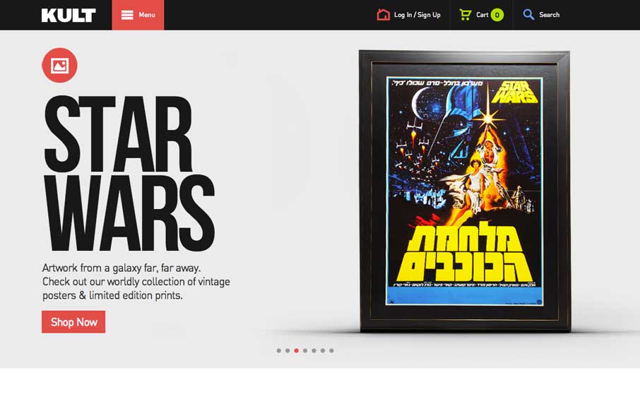
Good simple layout, just kind of a blocky and bold presentation of stuff. What’s interesting to me is how when you interact with the menu it grays out the content, keeping you focused on the menu navigation itself. What do you guys think of that?
Monochrome Minimalism
Monochrome Minimalism merges Bauhaus discipline with IKEA simplicity. Clean grids, muted tones, and functional beauty create digital calm, proof that restraint, not decoration, defines timeless design.


0 Comments