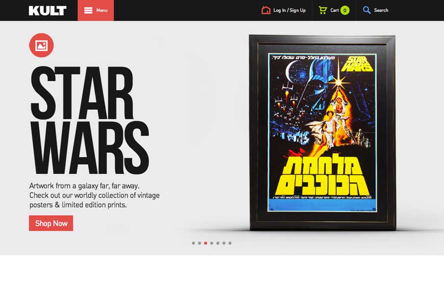
Good simple layout, just kind of a blocky and bold presentation of stuff. What’s interesting to me is how when you interact with the menu it grays out the content, keeping you focused on the menu navigation itself. What do you guys think of that?
Beyond the Basics: Unlocking the Real Power of CSS Pseudo-Classes
Unlock the full potential of CSS pseudo-classes. Go beyond :hover and explore powerful, modern techniques that reduce code bloat, enhance accessibility, and replace JavaScript with smarter, scalable styling.


0 Comments