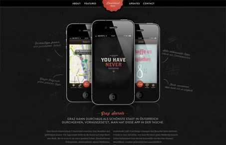
Very visually rich with very little worked into it. I love it when something simple like this design can look so rich and deep. I really love the almost chalkboard like background & writing. The animated logo/shape is also pretty cool as an attention grabber. Can’t wait to check out the app now!


0 Comments